This guest article was written by Nicolas Tröger. Nicolas is a software developer and computer science student specializing in software engineering, cloud, virtualization, and IT security. He has also gained hands-on experience in data engineering, particularly in building data pipelines and working with open data.
What This Post Covers
- How storm-related casualties and climate policy support can be compared across U.S. states
- Using R for aggregation, correlation analysis, and visualization
- Results and Discussion of data limitations, alternative measurements, and future research directions
Climate change is a global issue, and large emitters like the U.S. play a critical role in addressing it. However, political division complicates action, as major parties have opposing views on climate change. The voter’s stance varies significantly, especially in economically difficult times many people deprioritize climate change action. On the other hand, studies show storm weather events are happening more often and with increased intensity, which can be partially explained by increasing average world temperatures. Once big storms and weather events happen, temporary peaks in public interest about action against climate change are present, and such debates shift into the center of public discussion.
Hence, finding the factors that motivate the public interest in action against climate change is important. Consequently, one may ask: Do communities that experience more severe consequences of storms, floods, or heatwaves also show stronger support for policies aimed at tackling climate change?
In this third post of the series, we shift our attention from data preparation to data analysis. Now that the datasets are cleaned and structured, it is time to explore them, look for patterns, and test whether a relationship exists between selected variables.
We will work with two datasets that were found in our the first blog post of the series and capture both the physical impact and the public response:
- Casualties from weather events across U.S. states in 2020, based on NOAA’s Storm Events Database.
- Public opinion on climate action by state, drawn from Yale University’s Climate Change Opinion Map of the year 2020.
In the second post of this series, we walked through how these raw sources were cleaned, transformed, and prepared using Jayvee, a domain-specific language for building data pipelines. The result was two structured SQLite databases ready for analysis.
The resulting datasets are the following:
Storm weather event-related casualties
| STATE | INJURIES_DIRECT | INJURIES_INDIRECT | DEATHS_DIRECT | DEATHS_INDIRECT | TOTAL_CASUALTIES |
|---|---|---|---|---|---|
| GEORGIA | 3 | 0 | 0 | 0 | 3 |
| KANSAS | 100 | 212 | 0 | 8 | 312 |
| KANSAS | 0 | 3 | 0 | 0 | 3 |
| KANSAS | 5 | 0 | 0 | 0 | 5 |
| COLORADO | 0 | 0 | 0 | 0 | 0 |
| COLORADO | 0 | 0 | 5 | 0 | 5 |
| KANSAS | 6 | 0 | 0 | 0 | 6 |
| COLORADO | 102 | 0 | 0 | 0 | 102 |
Avg. Support for Climate Action (% per capita)
| GeoType | GeoName 2 | CO2limits | drilloffshore | … | AverageOpinionTrend |
|---|---|---|---|---|---|
| State | WYOMING | 70,49 | 85,49 | … | 77,99 |
| State | KANSAS | 33,45 | 68,98 | … | … |
Specifically, we will examine:
- TOTAL_CASUALTIES – combined direct and indirect injuries and deaths from weather events per state.
- AverageOpinionTrend – average percentage of residents supporting climate action in the respective state.
We consider these variables representative of how a state and it is people are affected by climate-related storm weather events and the corresponding public opinion about action against climate change.
For our analysis, we use a correlation approach. In simple terms – correlation looks at whether two things move together and how strong that connection is. It does not explain why they might be related, only whether a pattern can be observed. Our goal here is to see if public opinion and weather casualties show any kind of link, and if so, how strong it is.
Analyzing the data with R
What is R?
For this task, we used R, a statistical programming language common in data science, analytics, and research. R itself is a language, but there are tools like RStudio that can help write and run the code as well as visualize plots.
R can be described as a domain-specific language, as its syntax is highly optimized for data manipulation and statistical modeling – much like Jayvee is specialized for data preparation pipelines, R is specialized for statistical analysis and visualization. This makes it an ideal choice for correlation analysis in our case study.
While we will not go through and in-depth explanation on how to use R, we are going through the R-script used to analyze and visualize the data.
1. Load Required Libraries
library(RSQLite)
library(dplyr)
First, we need to load external libraries to interact with SQLite databases:
- RSQLite allows R to connect to and query SQLite databases directly.
- dplyr provides concise, readable syntax for data manipulation (grouping, joining, summarizing)
2. Connect to Databases and Load Tables into R
sqlite_file1 <- "data/political_opinion.sqlite"
sqlite_file2 <- "data/weather_event_damages.sqlite"

conn1 <- dbConnect(SQLite(), sqlite_file1)
conn2 <- dbConnect(SQLite(), sqlite_file2)

political_opinion <- tbl(conn1, "political_opinion") %>% collect()
weather_event_damages <- tbl(conn2, "weather_event_damages")
We start by saving the path to the sqlite files of the local file system as a string in variables. With dbConnect we create an actual connection to the SQLite databases to perform sql-queries. The tbl()-command let us read entire tables of the respective database by providing the sql-table name, which will be stored as lazy sql tables in R-variables. Notice, that the political_opinion table has a collect() command in the end, due to it being fully loaded as data in the R-context. For our weather_event_damages, we keep the table in an in-between state, since we will perform a few operations on it and collect it as a full data table afterward – that is how the library works.
While we performed most of the dataset’s transformations with Jayvee, we need one more operation that is easily done by using dplyr.
3. Aggregate Casualties by State
grouped_table <- weather_event_damages %>%
  group_by(STATE) %>%
  summarize(grouped_total_casualties = sum(TOTAL_CASUALTIES, na.rm = TRUE)) %>%
  collect()
The weather_event_damages dataset has multiple rows per state. For a correlation analysis, we need exactly one data point mapped to another. Hence, we need to aggregate those multiple rows to one sum. With the group_by statement we group all rows of the dataset together per state while instruction R to summarize all TOTAL_CASUALTIES per state. Afterward, we collect the data as an actual R data table – like we saw prior to this.
4. Join datasets on State Names
joined_table <- grouped_table %>%
  inner_join(political_opinion, by = c("STATE" = "GeoName"))
joined_data <- collect(joined_table)
Now, we perform an inner join between both tables by declaring a common key (column) on which the values will be matched to map rows to each other and therefore building 2-dimensional data points where an TOTAL_CASUALTIES value is connected to a AverageOpinionTrend value per state. Choosing an inner join also only keeps combined data rows where in both datasets the state exists to avoid errors.
5. Calculate Correlation
correlation_result <- cor(joined_data$AverageOpinionTrend,
                          joined_data$grouped_total_casualties,
                          use = "complete.obs")
By default, the cor-function calculate the Pearson correlation coefficient. We use Pearson if we want to see whether two variables follow a linear relationship – basically, if one goes up, does the other also go up (or down) in a straight-line pattern?
But not all relationships are perfectly straight. An alternative is the Spearman correlation coefficient. Instead of looking for a linear trend, it checks whether the rank order of the values is consistent. In other words, if you line up the states from lowest to highest opinion scores, do the casualty numbers line up in roughly the same order?
For this first analysis we stick with Pearson, since it gives a quick and widely used measure. The result is stored in the correlation_result variable as a single number that tells us how strong – and in which direction – the relationship is.
6. Create Scatter plot
Lastly, we can create a basic R-Plot by providing the respective columns, and some configuration for visual details and titles. We also caculate and provide the min and max values of each column, so the axes start at zero.
x_min <- 0
x_max <- max(joined_table$AverageOpinionTrend, na.rm = TRUE)
y_min <- min(joined_table$grouped_total_casualties, na.rm = TRUE)
y_max <- max(joined_table$grouped_total_casualties, na.rm = TRUE)


plot(
  joined_table$AverageOpinionTrend,
  joined_table$grouped_total_casualties,
  main = "No Observable Link Between Opinion Trend and Casualties",
  xlab = "Average Opinion Trend",
  ylab = "Total Casualties",
  pch = 19,
  col = "blue",
  xlim = c(x_min, x_max),
  ylim = c(y_min, y_max)
)
By leaving out the x and y limits as well as a new calculated linear line to show the correlation line (model <- … and abline(…), we can end up with two resulting scatter plots.
plot(
  joined_table$AverageOpinionTrend,
  joined_table$grouped_total_casualties,
  main = "No Observable Link Between Opinion Trend and Casualties",
  xlab = "Average Opinion Trend",
  ylab = "Total Casualties",
  pch = 19,
  col = "blue"
)

model <- lm(grouped_total_casualties ~ AverageOpinionTrend, data = joined_table)
abline(model, col = "red", lwd = 2)
legend("topright", legend = paste("Correlation:", round(correlation_result, 2)), bty = "n")
7. Results
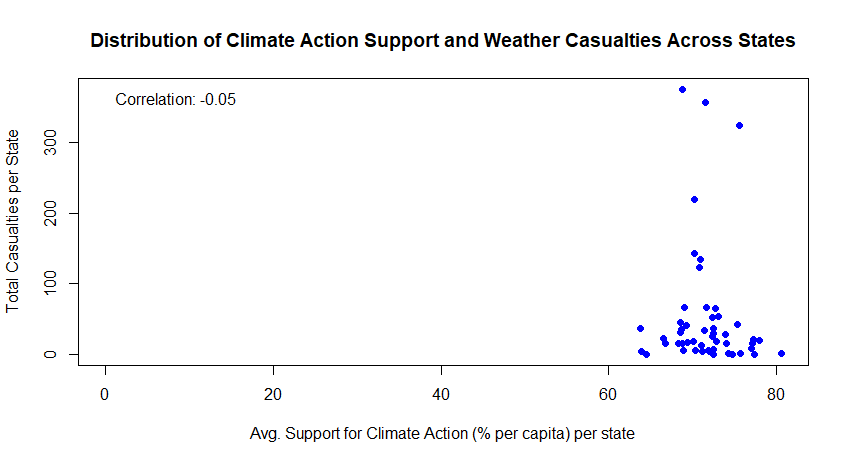
Our first calculated scatter plot gives us Figure 1. The analysis produced a dataset of 51 states after joining both sources. The scatter plot illustrates the distribution: most states cluster between 60-80% support for climate action and 0-100 casualties, with a few outliers like Tennessee, Arizona and Calfornia reaching more than 300 total casualties. Before looking at the number itself, we need to know what a correlation coefficient actually tells us. The value always falls between -1 and 1. A value close to 1 means a strong positive relationship (as one goes up, so does the other). A value close to -1 means a strong negative relationship (as one goes up, the other goes down). And a value around 0 means there is basically no linear correlation at all.
The Pearson correlation coefficient we calculated between average public support for climate action and total casualties from weather events is -0.05. This means there is virtually no linear relationship between the two variables.
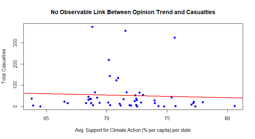
Zooming in and drawing a regression line (red) makes it easier to see the overall trend. A regression line is the best-fit straight line through the data points, and its slope indicates the direction and strength of the relationship. In this case, the slope is almost flat, which directly mirrors the near-zero correlation coefficient and further confirms the absence of a meaningful relationship. The data suggest that, at the state level, the severity of weather-related casualties does not exhibit a clear statistical link to the public opinion on climate measures.
Discussion
Our results suggests that, at the state level in the U.S., there is no clear linear relationship between storm-related casualties and public support for climate change countermeasures. The Pearson correlation coefficient of -0.05 indicates a near-zero connection, and the scatter plots confirm that high or low casualty numbers do not consistently correspond to stronger or weaker climate support. At the same time, it is notable that across most states there is a relatively consistent level of support for climate action, typically clustering between 60-80%. This baseline agreement implies that, regardless of the immediate impact of storm events, public attitudes are influenced by broader national discourse or shared values rather than just direct exposure to extreme weather.
Methodologically, we can see several factors that may have influenced these findings. The analysis is based on only 51 data points which is a relatively small sample for detecting subtle patterns. Aggregating data at the state level may also mask localized effects: within a single state, certain counties might experience severe storm impacts while others remain largely unaffected, and averaging across the state could hide these effects. Technically, both datasets actually include county-level data, but we could not match them up because of inconsistencies in county naming. Future work could try to clean and map those names more carefully to see if a county-level analysis paints a different picture.
While personal experience could still be a relevant factor, casualties just might not be the best representation of it. There are a lot of confounding factors, like how different states have different disaster preparation and protection measures, that make total casualties not the best way to measure how people experience climate change-related weather events. You can also see this in the many zero-values regarding casualties on a county level and the few counties with more severe weather events and corresponding casualties.
If we look at financial damages, for example, we can get a better idea of how people have experienced storm weather events. As figure 3 shows, there are many cases with no casualties while financial damages going up into millions of dollars.
This would allow us to measure “smaller” experiences with storm weather events more accurately. But we did not go with this approach because of the problematic data format, as discussed in blog post 2. Generally speaking, future work could try and use a different measurement here.
When it comes to climate change, public opinion is influenced by multiple of social, political, and psychological factors that might have a bigger impact than direct storm experiences. Political beliefs, partisanship, and how the media reports on something can all have a big impact on how people think. But sometimes, if there is misinformation or conspiracy theories, people might not be as likely to support climate action after experiencing a storm. Short-term spikes in concern after extreme weather might also fade over time, meaning that annual aggregated data might not capture these short while reactions.
Conclusion
With this post, we end our series and carried out an actual data analysis by bringing together two structured datasets and testing whether storm-related casualties are connected to public support for climate action. Using R, we aggregated, joined, and correlated the data before visualizing the results. The outcome: At the state level, there is no meaningful linear relationship between the severity of storm casualties and the strength of public opinion on climate countermeasures.
This result highlights two important points. First, public attitudes toward climate change seem to be shaped more by broader political and social dynamics than by direct exposure to extreme weather events. Second, the choice of measurement matters: casualties alone may not capture how communities experience storms, while financial damages or other indicators could give more fitting insight.
While this study was necessarily limited by state-level aggregation and data availability, it provides a reproducible starting point for deeper research. A more granular, county-level approach, the use of a different measurement or the inclusion of additional factors such as political affiliation or media coverage, could offer richer insights into how personal experience interacts with public opinion.
A GitHub Repository with all used scripts and nessecary links for reproduction can be found here.
AI Disclaimer
During the preparation of this work the author, as a non-native speaker, used LanguageTool and ChatGPT in order to improve wording, grammar and spelling. After using these tools, the author reviewed and edited the content as needed and takes full responsibility for the content.